Barclays App Redesign: A modern, user-centered approach
Product Design
October 2025 - January 2026
User Research, Prototyping, Visual Design

Overview
This project restructures the Barclays mobile banking app, shifting from an account-first model to an activity-first experience. It aims to address user feedback on the current design by making transactions more accessible, improving accessibility through larger icons and a more legible interface, making the spending tool easier to understand, and simplifying account switching for users with multiple accounts.
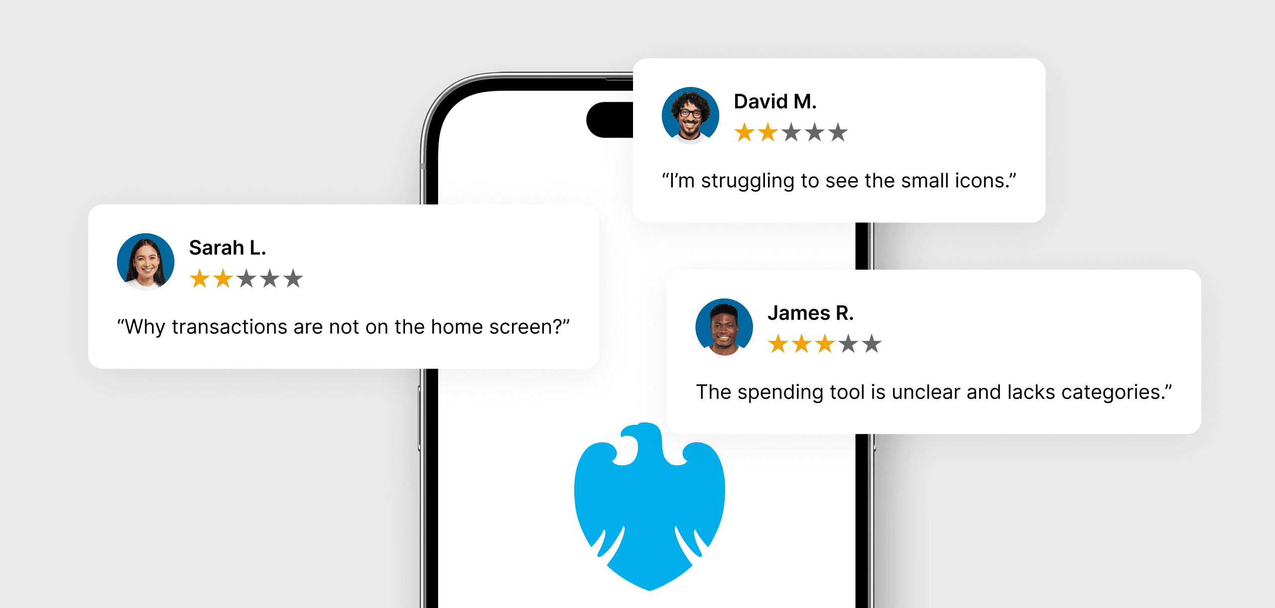
The redesign process began with analyzing user feedback from Google Play and the App Store, identifying their frustrations, and grouping them into archetypes with defined pain points.

Why Barclays App?
Barclays is one of the UK’s largest banks, serving millions of customers through its mobile app. Despite its popularity, user reviews often highlight frustrations around cluttered navigation, hidden actions, and limited spending insights. This made it an ideal candidate for a redesign that focuses on usability and clarity.
Who Are Barclays Users?
Barclays’ user base represents a broad and diverse audience. The app will be used by individuals of all genders aged 18 and above. Users will have varying levels of financial knowledge, different comfort levels with technology, and accessibility needs. A common concern among them is managing their personal finances.
User Archetypes & Pain Points
To better understand Barclays app users, I gathered reviews from the App Store and Google Play. Different users raised different frustrations, which I grouped into four archetypes with pain points assigned to each one.

The Essentials User
These users rely on the app for daily financial management, such as checking their balance, viewing recent transactions, and sending payments. They value speed and simplicity over advanced features.
Pain Point:
Transactions are buried deep in the app, making it harder to quickly view recent activity.

The Accessibility Seeker
These users depend on clear, accessible design to manage their finances. They benefit from text that is easier to read, stronger contrast, and larger icons that make core tasks easier to complete.
Pain Point:
Icons are small and hard to see, making navigation less intuitive.

The Spending Analyst
These users are finance-savvy and want deeper insights into their spending. They look for modern, easy-to-read visuals and a wider range of categories to clearly track where their money is going.
Pain Point:
Spending insights are limited, with inaccurate categories that make tracking difficult.

The Multi-Account User
These users manage multiple accounts, such as current, joint, business, or a Barclaycard. They value a seamless experience that lets them switch easily and stay on top of their money.
Pain Point:
Switching accounts requires unnecessary navigation, making it harder to manage money across them.
Problem Statement
Users of the Barclays app are finding it difficult to navigate key features such as viewing transactions and managing different accounts. The interface feels cluttered and unintuitive, leading to confusion and slower task completion.
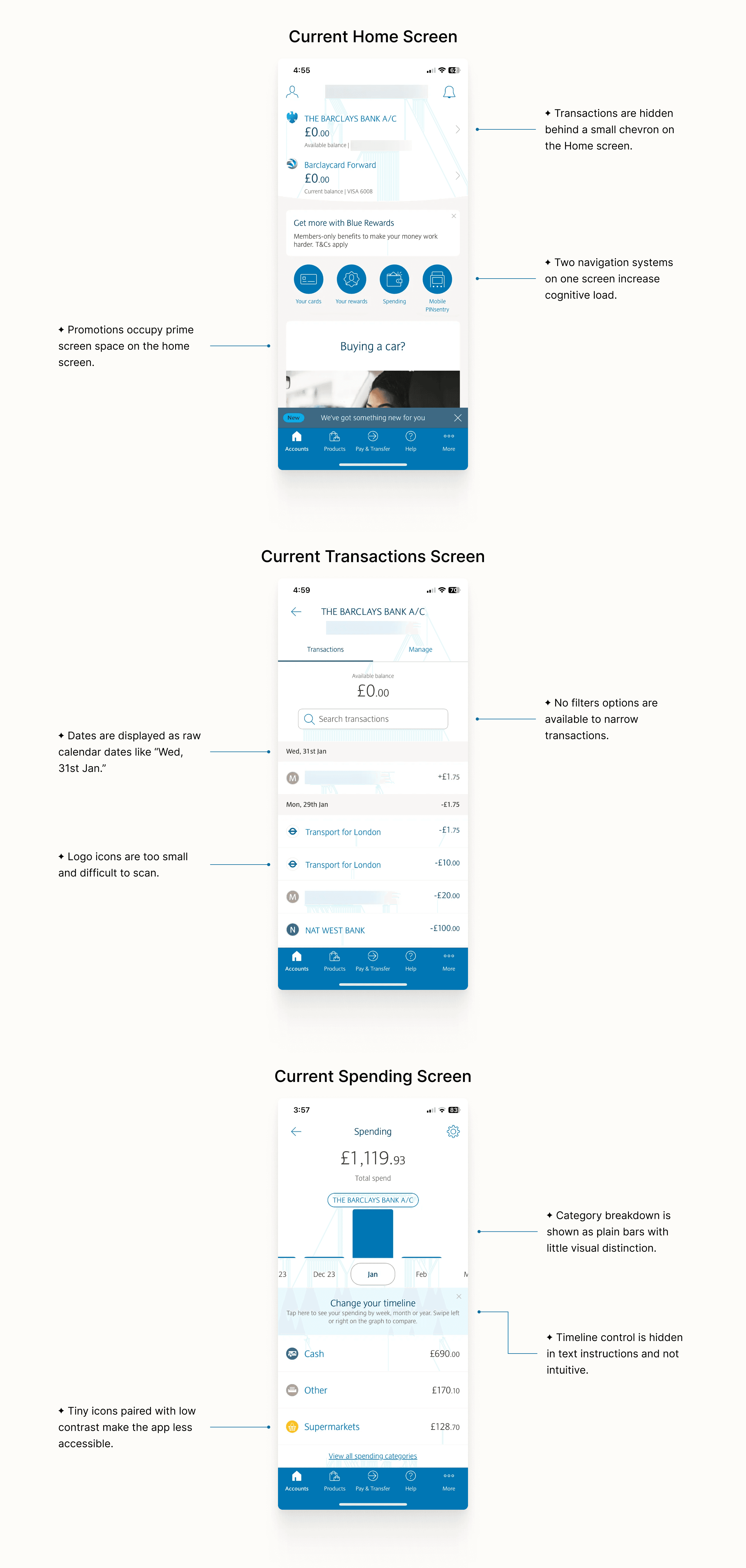
Current Design Analysis
To better understand these friction points, the following analysis explores visual and interaction patterns, highlighting opportunities to support users’ needs across the three most frequently used screens of the app.
Proposed Solution
This redesign shifts the focus of the Barclays app back to what matters most: managing money with ease and clarity. It prioritises core tasks like viewing transactions and tracking spending, while a cleaner, modern interface reduces clutter and makes everyday banking more intuitive and pleasant.
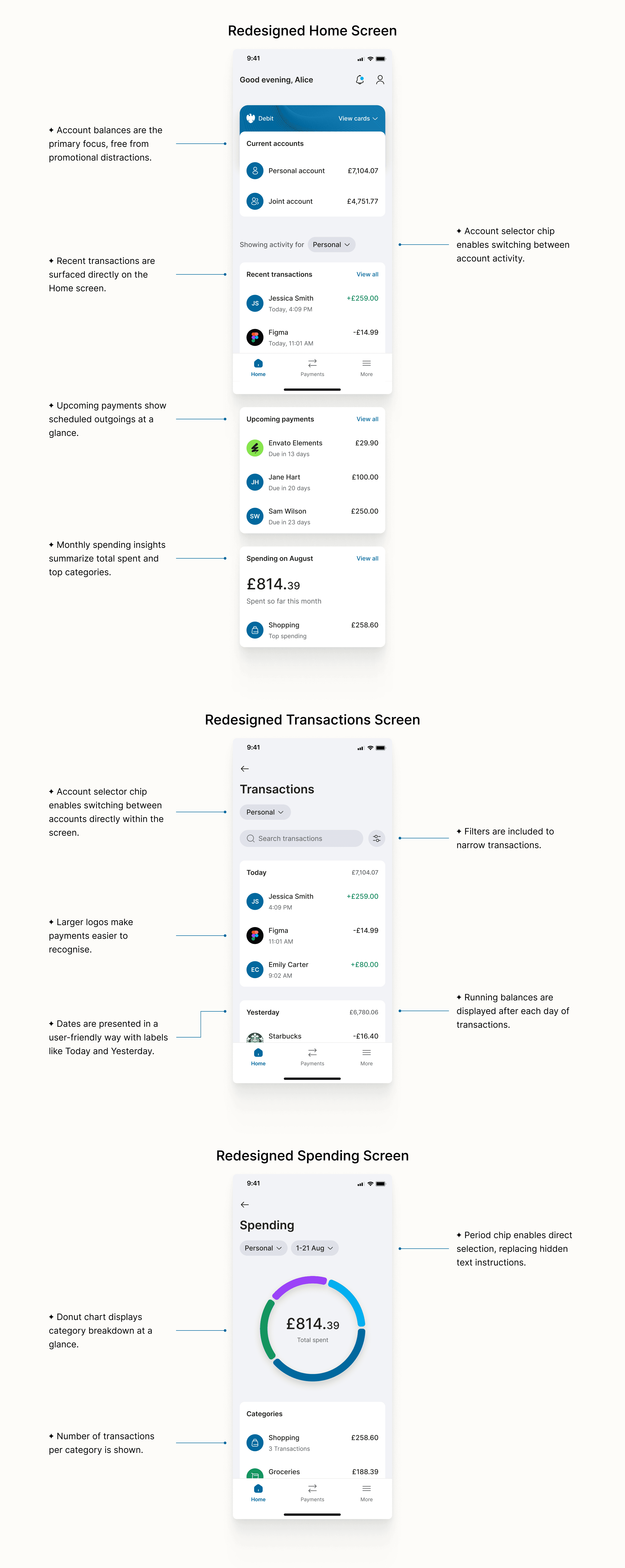
High-Fidelity Prototypes
Instant Activity Access
To address the pain point of buried data, the redesign surfaces recent transactions directly on the Home screen. This allows the "Essentials User" to verify their latest activity in a single glance, without having to tap on chevrons.
Accurate Spending Breakdown
To fix the lack of clear spending insights, the redesign introduces a donut chart that gives an instant breakdown by category. Users can tap into any segment to drill down and view the full transaction history behind it, with a period chip enabling quick selection of different time ranges.
Seamless Account Switching
To solve the frustration of returning to the Home screen to switch accounts, the redesign surfaces account activity on the home screen and introduces account selector chips, letting users switch accounts directly from Home, activity screens, or while preparing a payment.
Acknowledging trade-offs
While the redesign addresses the key pain points of the identified archetypes, it also introduces trade-offs. Traditional banking apps follow an account-based model: users tap into an account card and view activity within that dedicated space. This structure creates clear separation and a strong sense of ownership.
In contrast, my redesign flattens this hierarchy by surfacing account activity directly on the Home screen. This reduces navigation friction, particularly for users managing multiple accounts. However, some users may prefer the traditional model, where each account has a clearly defined “home.”